Chapter 11
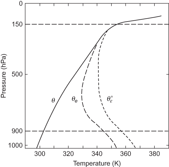
FIGURE 11.1 Typical sounding in the tropical atmosphere showing the vertical profiles of potential temperature θe, equivalent potential temperature θ* ε, and equivalent potential temperature of a hypothetically saturated atmosphere with the same temperature at each level. This figure should be compared with Figure 2.8, which shows similar profiles for a midlatitude squall line sounding. (After Ooyama, 1969. Copyright © American Meteorological Society. Reprinted with permission.)
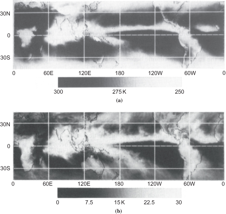
FIGURE 11.2 (a) Time-mean IR brightness temperature and (b) three-hour standard deviations about the time-mean IR brightness temperature for August 14 to December 17, 1983. Low values of brightness temperature indicate the presence of high cold cirrus anvil clouds. (After Salby et al., 1991. Copyright © American Meteorological Society. Reprinted with permission.)
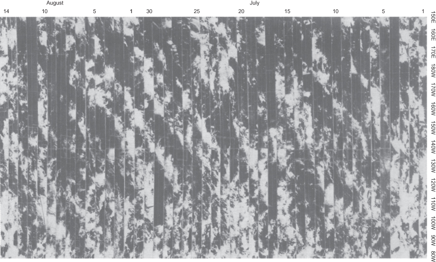
FIGURE 11.3 Time-longitude sections of satellite photographs for the period July 1 to August 14, 1967, in the 5 to 10°N latitude band of the Pacific. The westward progression of the cloud clusters is indicated by the bands of cloudiness sloping down the page from right to left. (After Chang, 1970. Copyright © American Meteorological Society. Reprinted with permission.)
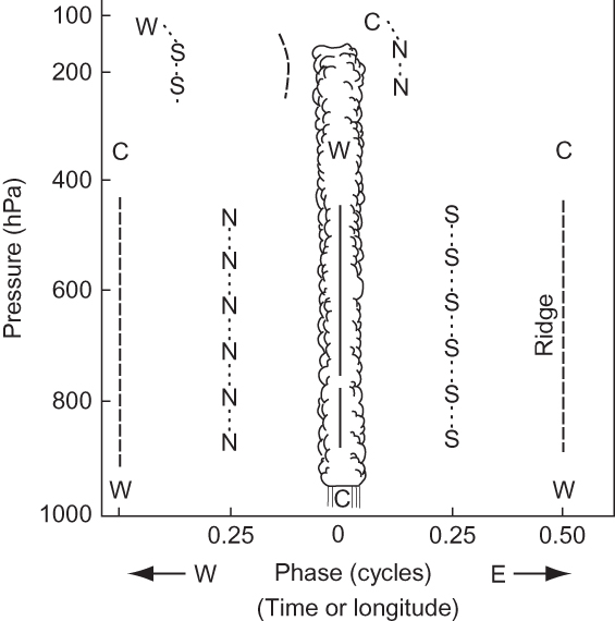
FIGURE 11.4 Schematic model for equatorial wave disturbances showing trough axis (solid line), ridge axis (dashed lines), and axes of northerly and southerly wind components (dotted lines). Regions of warm and cold air are designated by W and C, respectively. The axes shown are for northerly (N) and southerly (S) wind components. (After Wallace, 1971. Copyright © American Geophysical Union. Used with permission.)
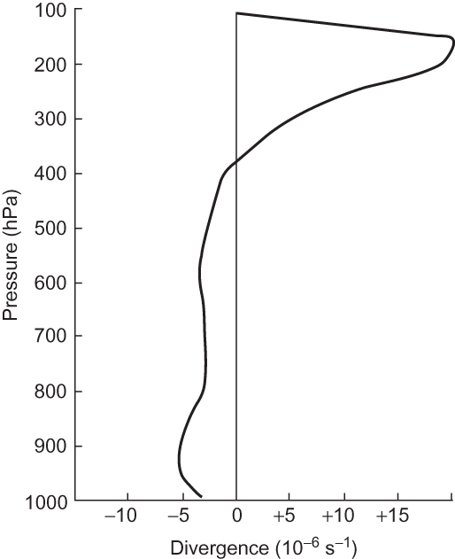
FIGURE 11.5 Vertical profile of 4°-square area average divergence based on composites of many equatorial disturbances. (Adapted with permission from Williams, 1971.)
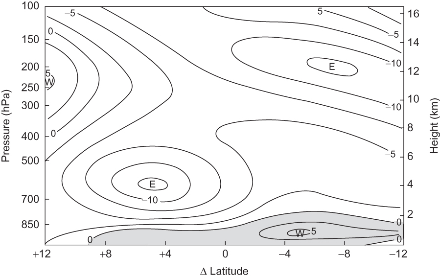
FIGURE 11.6 Mean-zonal wind distribution in the North African region (30°W to 10°E longitude) for the period August 23 to September 19, 1974. Latitude is shown relative to latitude of maximum disturbance amplitude at 700 hPa (about 12°N). The contour interval is 2.5 m s-¹. (After Reed et al., 1977. Copyright © American Meteorological Society. Reprinted with permission.)
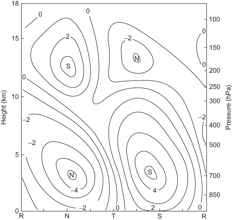
FIGURE 11.7 Vertical cross-section along the reference latitude of Figure 11.6 showing perturbation meridional velocities in m s-¹. R, N, T, and S refer to ridge, northwind, trough, and southwind sectors of the wave, respectively. (After Reed et al., 1977. Copyright © American Meteorological Society. Reprinted with permission.)
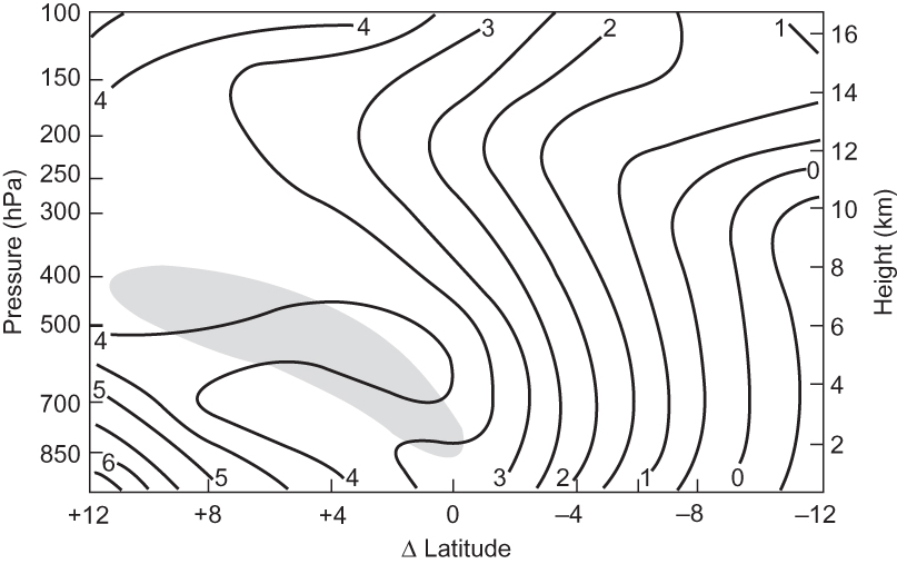
FIGURE 11.8 Absolute vorticity (units 10–5s–1) corresponding to the mean wind field of Figure 11.6. Shading shows region whereβ—∂²ü / ∂y² is negative. (After Reed et al., 1977. Copyright © American Meteorological Society. Reprinted with permission.)
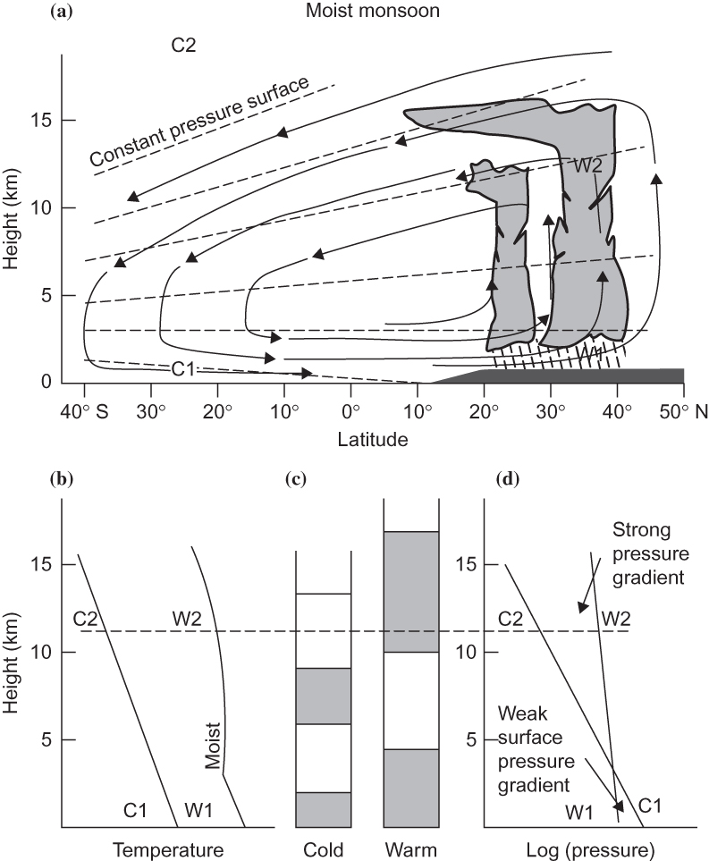
FIGURE 11.9 Schematic representation of the moist phase of the Asian monsoon. (a) Arrows show the meridional circulation, dashed lines the isobars. (b) Temperature profiles for columns C1 to C2 and W1 to W2, respectively. (c) Schematic of the mass distribution in the cold and warm sectors. (d) Horizontal pressure difference as a function of height. (After Webster and Fasullo, 2003.)
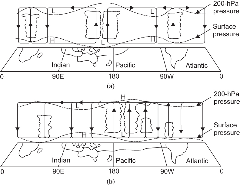
FIGURE 11.10 Schematic diagrams of the Walker circulations along the equator for (a) normal conditions and (b) El Niño conditions. (From Webster, 1983, and Webster and Chang, 1988. Copyright © American Meteorological Society. Reprinted with permission.)
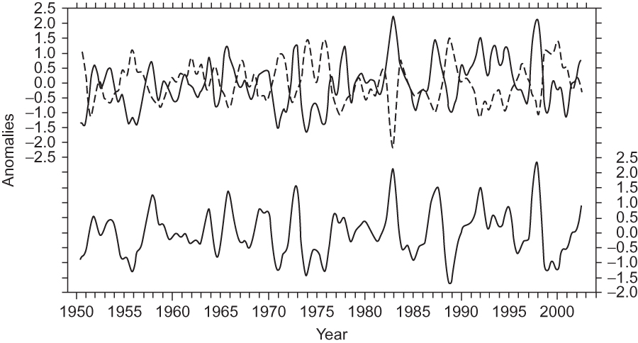
FIGURE 11.11 Time series showing SST anomalies (°C) in the eastern Pacific (lower curve) and anomalies in sea-level pressures (hPa) at Darwin (upper solid curve) and Tahiti (upper dashed curve). Data are smoothed to eliminate fluctuations with periods less than a year. (Figure courtesy of Dr. Todd Mitchell, University of Washington.)
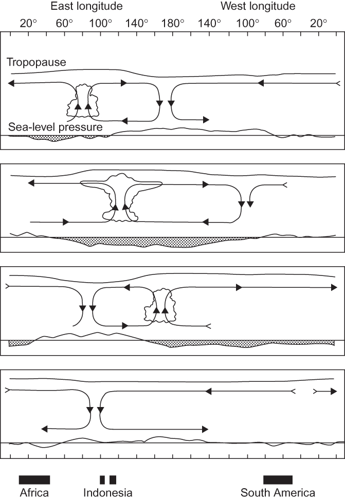
FIGURE 11.12 Longitude-height section of the anomaly pattern associated with the tropical intraseasonal oscillation (MJO). Reading downward, the panels represent a time sequence with intervals of about 10 days. Streamlines show the west–east circulation, the wavy top line represents the tropopause height, and the bottom line represents surface pressure (with shading showing below-normal surface pressure). (After Madden, 2003; adapted from Madden and Julian, 1972.)
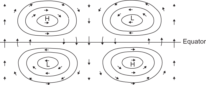
FIGURE 11.13 Plan view of horizontal velocity and height perturbations associated with an equatorial Rossby–gravity wave. (Adapted from Matsuno, 1966. Used with permission of the Japan Society for the Promotion of Science.)
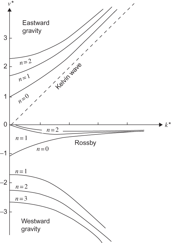
FIGURE 11.14 Dispersion diagram for free equatorial waves. Frequency and zonal wave numbers have been nondimensionalized by defining ν* ≡ ν ⁄ (β√ghe)½ k* ≡ k(√ghe ⁄ β)½. Curves show dependence of frequency on zonal wave number for eastward and westward gravity modes and for Rossby and Kelvin modes. (k* axis tic marks at unit interval with 0 on left.)
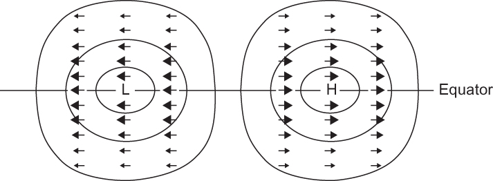
FIGURE 11.15 Plan view of horizontal velocity and height perturbations that are associated with an equatorial Kelvin wave. (Adapted from Matsuno, 1966.)
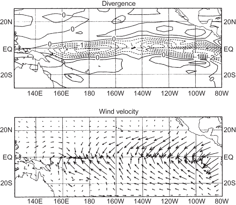
FIGURE 11.16 Steady surface circulation forced by sea surface temperature anomalies characteristic of El Niño in the equatorial Pacific. (Courtesy of D. Battisti.)